User Interface Design Guide
To have a common look & feel on all the platforms OOBD is supposed to run,its been planned to have a similar behavior as a web browser, which means in general to have a single, stateless page, from where you can move away by selecting something, or you can jump one page back using a back - button.
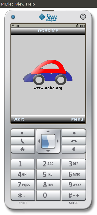
When the program starts, at first it is shown
- the OODB logo
- the OOBD URL
- optional: A selection method of the script engine to use, if the implementation supports more as one engine
- a start button (to start straight with the actual settings)
- a menu entry for configuration
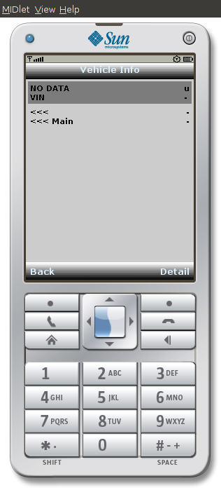
When a script engine is started, a page is generated containing all the visualizers of that page.
Each visualizer shows at least 3 different information:
- the actual value (that can be e.g. text, a symbol, a analog bar graph etc.)
- the meaning of that value (text, an image, the tool tip of an icon etc.)
- a set of flags, where up to now 3 are defined:
- reprents that visualizer another submenu
- is that visualizer update-able?
- is that visualizer auto- refresh-able?
- is that visualizer loggable?
The flags are splited into system and user flags. 8 flags (0-7) are reserved for system, 8 free for the application.
The meaning of the system flags and their appearance are defined as follow:
| System Flag appearance | |||
|---|---|---|---|
| Nr | Meaning | Textual | Symbol |
| 0 | Sub-Menu | > |  |
| 1 | Update | U |  |
| 2 | Auto-Refresh (Timer) | T |  |
| 3 | Log | L |  |
| 3 | Back to previous Menu | < |  |
Where of course the size of the symbols are driven by the available space.
If a flag is not set, it either shown textual as a dot . or the symbol is grayed out.
Example:
On these pages there's either a “hardwired” Back- Key on the device itself or a Back- Button ![]() to go back to the previous page.
to go back to the previous page.
The value of on visualizer is been updated (or the action of such visualizer) is been started by
- selecting the entry and press the main “ok” button on devices with key controls
- tap on the visualizer on devices with touchscreen
- double click on that visualizer on mouse controlled device
Each visualizer also has a context menu containing the following function calls:
- Detail (optional): If the whole text might not fit onto the screen, this function opens a scrollable text area to show the complete visualizer output
- toogle flags: Each available flag (see above) can be toggled on or of separately
The next three function can either be also in the page menu or on the page itself, that's up to the application:
The Output Textview
The application also has a text output area belongs to for collecting all text outputs the script engines do. For these text area the following rules applies:
- normally the “text window” is hidden in the background. It comes to front, when a new output is made
- the text area is not cleared when the page is rebuild with different content
- the text area supports the following buttons


